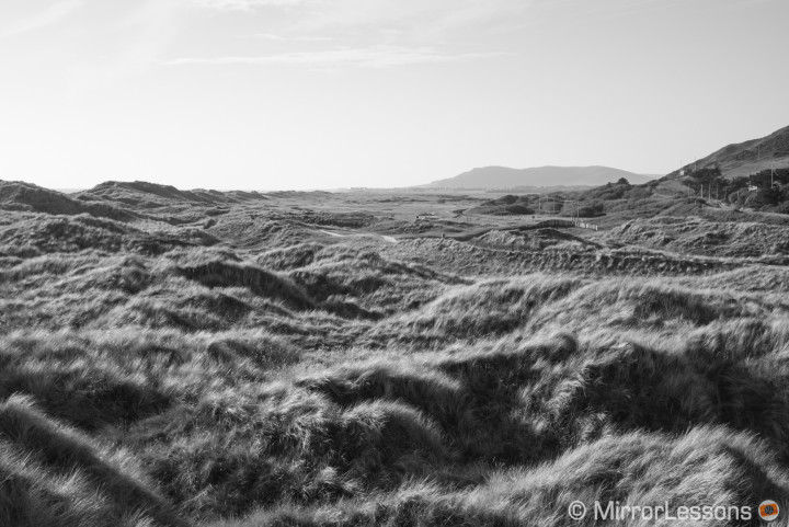
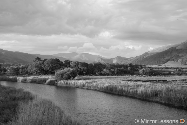
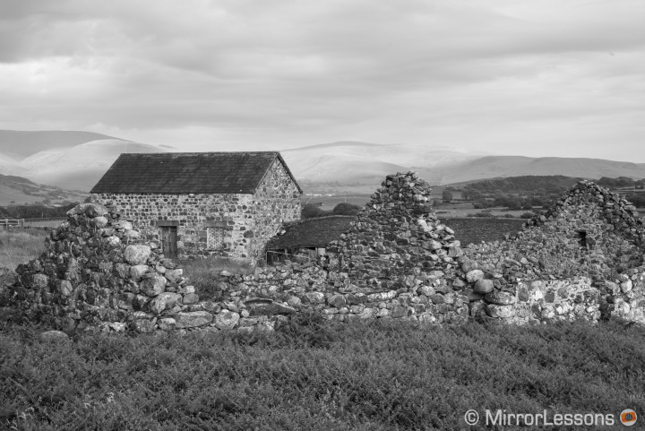
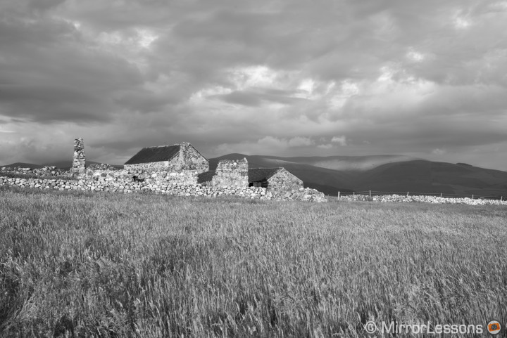
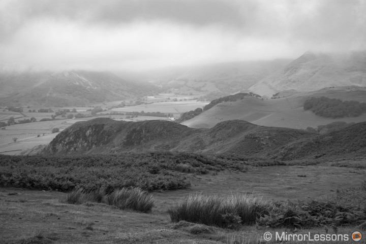
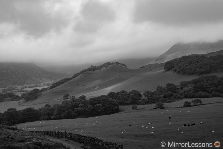
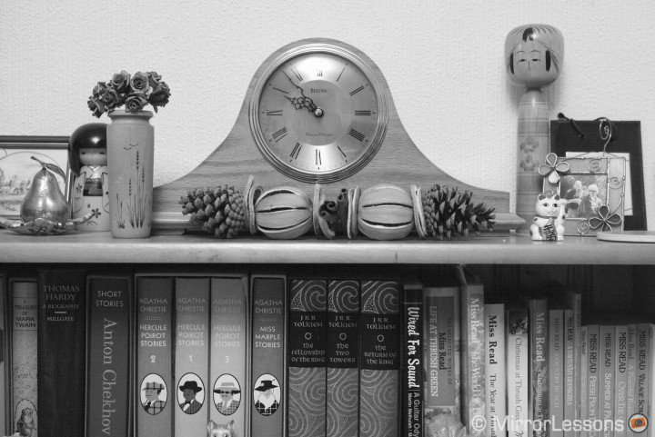
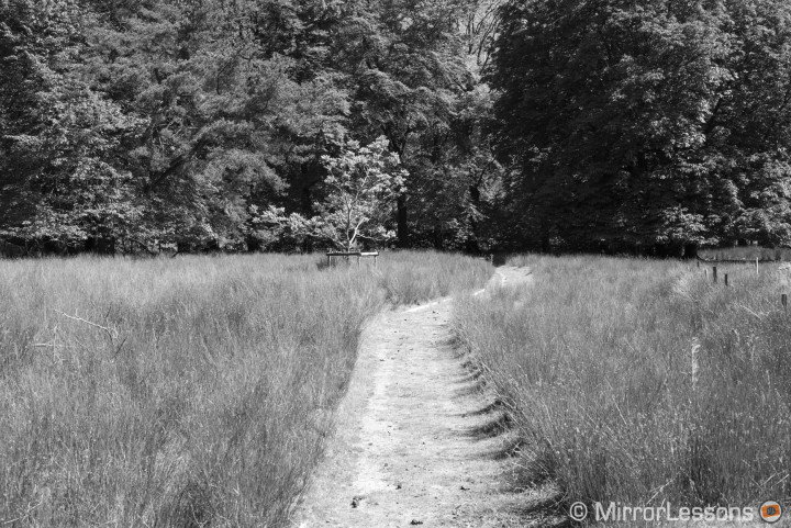
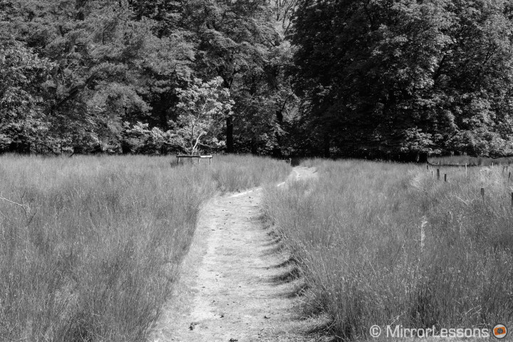
At the dawn of photography and motion pictures, monochrome was the only option for those who wanted to make images. When colour photography arrived on the scene, it was more expensive than B&W and therefore less accessible to the general public. However, as colour photography began to permeate the market and come down in price, monochrome imagery gradually became more of an artistic choice.
Today, we live in an era where digital imaging is at everyone’s fingertips. Even the simplest cameras deliver a wide array of options – colour, monotone, filters, effects, and more. What’s more, you have the freedom to adjust everything after the shoot.
This is why, in an increasingly competitive market where top performance and advanced features count, the Leica M Monochrom may appear out of place. A digital camera that can only shoot black and white may seem more like a step back than a step forward, especially if you consider that all it takes is the click of a button in Photoshop to convert a colour image into monochrome. But the fact that the Typ 246 is the second edition in the Monochrom series shows that there is a niche of people who think it is a good idea.
While waiting for the courier to deliver the camera to my doorstep, I turned to the web and our social outlets to observe the photographs that photographers we know and follow tend to post. Looking at their images, I was immediately reminded that black and white is still very popular and there are a lot of strictly B&W photographers in the digital age. A B&W camera could make perfect sense to a lot of them.
In terms of analog photography, the Leica Monochrom is akin to a black and white roll of film: once you’ve committed to it, there is no turning back. With it, you lose one simple convenience: the possibility to say “I’ll decide later.”


Leica M Monochrom (Typ 246) Main Specs
- Sensor: 24 megapixel 35mm full frame CMOS with no color filter
- Lens system: M mount
- Weatherproof: Partial (Splash and dust proof)
- Internal Stabilisation: None
- Autofocus: None
- Continuous shooting: 3 fps (up to 30 frames in JPG)
- ISO Sensitivity: 320 – 12500 ISO (extended up to 25000)
- Shutter Speeds: 1/4000 to 60 seconds
- Viewfinder: Optical rangefinder with 0.68x magnification
- LCD Screen: 3″ LCD monitor (921k dots)
- Movie recording: Full HD up to 25fps
- Built-in Flash: No
- Extra Features: Bracketing. Self-Timer
- Dimensions: 138.6 x 42.0 x 80.0 mm
- Weight: 680g (including battery and memory card)
[toc heading_levels=”3″]
My second experience with a Leica rangefinder
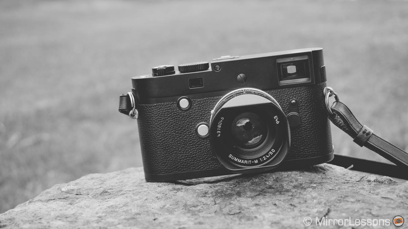
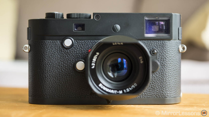
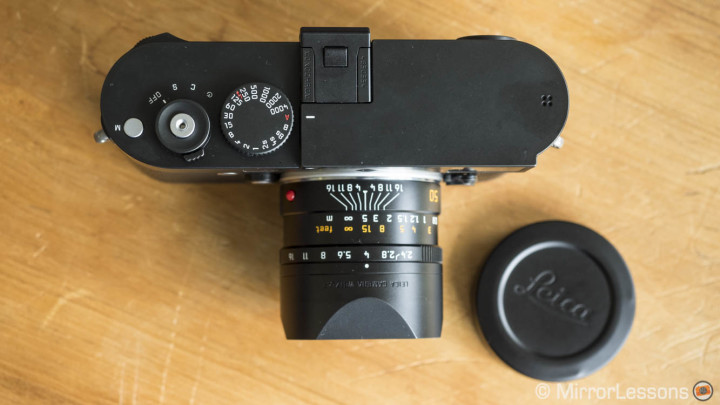
The Leica M Monochrom doesn’t look so different from its colour-shooting twin sister. In fact, it has exactly the same design and ergonomics as the M 240 with the only difference being that it is completely black and lacks the red logo as well as the white markings on top. The only non-black elements are the movie recording button on top and the two buttons on the front (focus assist and lens release buttons). The Monochrom also has an Image Field selector on the front that the M 240 lacks.
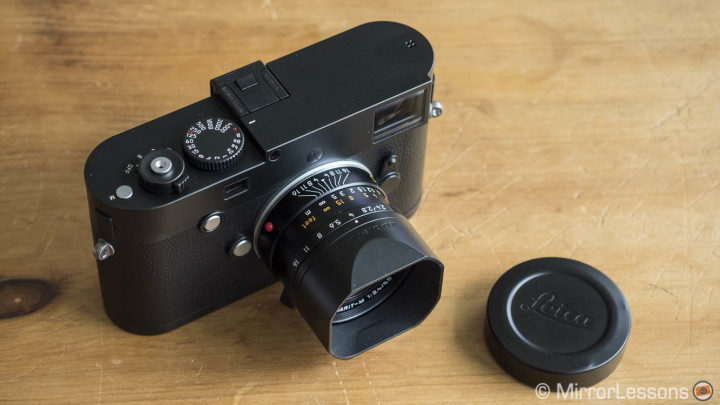
The first time I seriously used a Leica M was a few months ago when I had the chance to review the M Typ 240. I used it with two 35mm lenses (Summicron and Zeiss Distagon). The first thing I noticed was how uncomfortable the optical finder was for someone like me who wears glasses. With the 35mm angle of view, I could barely see the red and white lines that showed the limit of my frame, so I had a harder time composing my images. This time I asked for a 50mm and they sent me the Summarit f/2.4 version: perfect for the use I had in mind for the camera. Summarit lenses are the less expensive Leica M lenses but we are still talking about nearly $2000. I enjoyed using it and had no trouble with my glasses. While we always hear about the merits of Summicron and Summilux lenses, the Summarit defends itself quite well.
My first experience with the M was good but I admit that the ergonomics aren’t my favourite. I miss a more prominent grip on the front, although you can purchase one separately.
Since the Monochrom didn’t feel new to me, it didn’t take me long to get used to its ergonomics and design. This shows that one’s rapport with a camera can definitely improve over time.
The camera is built like a tank and the controls are pretty simple and straightforward, but I’m not saying anything new here. It has solid dials and buttons. The only dial I don’t really like is the rear dial on the right, as I often turn it by mistake (it can be used for exposure compensation). The straightforward button layout on the rear allows you to access all the main settings and operations. The menu system is good, although I would prefer that the SET button (a sort of quick menu) include the picture profile settings instead of having to dig in the Menu to reach them.
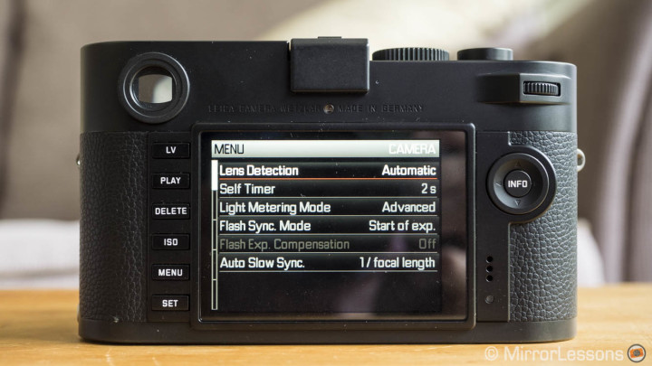
The sapphire glass LCD screen includes Live View with focus peaking. It needs to be activated with the dedicated Lv button, which is the same as any other information you want to appear on the screen. By default, the screen remains deactivated unless you request something like battery and memory status, which are accessible with the INFO button. I used Live View a couple of times for low-angle shots and when trying the video mode but otherwise I always forced myself to use the rangefinder and work in manual exposure.
Regarding the ease of use, there are a few things worth mentioning. The first is that you may notice some shutter shock at around 1/50 and 1/100s. The camera doesn’t offer any kind of stabilisation so I advise that you be careful when using slow shutter speeds. The MM 246 also has continuous shooting capabilities of 3fps with a decent buffer capacity. Despite not being labelled for action primarily, it proved useful during the cannon fire demonstration in Conwy two weeks ago.

Between black and white
Many photographers in the digital age tend to like very contrasty black and white pictures. Sometimes the light in the scene renders these strong shadows and highlights naturally. In other cases, we try to increase them in post production with our favourite software or with the help of dedicated B&W apps or plugins. Often I have the feeling that we try to bring back that strong contrast the light didn’t give us in the first place. We also have the tendency in increase clarity to bring back the perception of micro contrast and sharpness or simply because we want to give our image a punchy look.
Now when it comes to sharpness, rest assured that the Leica Monochrom renders detail wonderfully.
The sensor lacks both the Anti-Aliasing and colour filter. 24MP is a fine resolution – the details are just beautiful.

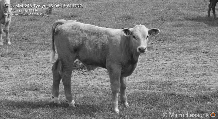


The only thing to be careful of are the highlights, so it is better to expose more to the left. The Monochrom sensor has good dynamic range but it is definitely stronger in the shadows, which is true of many full frame digital sensors. However, the Monochrom is less versatile if your exposure is not correct. In the case of highlights, you won’t be able to recover much if you overexpose by more than 1Ev. This is why I set the metering to classic instead of advanced because the former tends to lean more to the left.
Below you can see an example with a 14bit uncompressed DNG file and a -1.0 correction in the exposure slider with Lightroom. I wasn’t able to recover the details on the white shirt.
[twentytwenty]


[/twentytwenty]
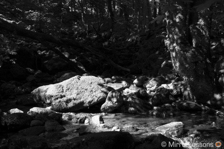
Detail retention in the shadows is better. Below you can see a second example with more than 2Ev recovery. If I had pushed it further, some white noise and banding would have started to appear.
[twentytwenty]

[/twentytwenty]
Keeping in mind the limits of the DNG file, I was curious to see how much post-production I would want to do with a monochrom camera from an artistic point of view. Usually I tend to not exaggerate the B&W look of my images and I often use the Rebecca Lily presets, as they give a more interesting and richer rendering. When it comes to hard contrast with the MM 246, the rendering is pretty much as you’d expect: good dynamic range, beautiful contrast and lots of detail. If you get your exposure right, the JPGs deliver excellent results as well. You can also intervene with contrast and sharpness, as well as add some sepia or silver tints but the last two don’t really interest me.

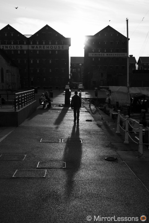

However the pictures shown above, especially the one of the boat, don’t do justice to what the Monochrom is capable of. Good high contrast can be achieved with many modern digital cameras…
…but where the Monochrom starts to really differentiate itself is with the mid-tones.
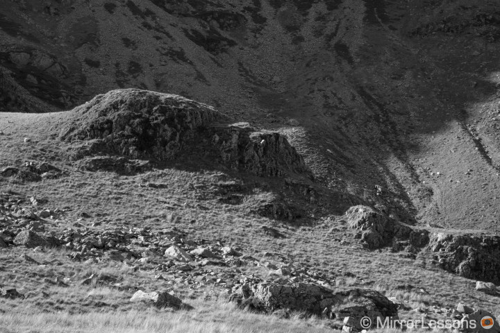
All these shades of grey give the picture an unusual richness and smooth rendering. This links back to the thoughts I shared at the beginning of this chapter. Sometimes we want too much contrast and we forget the beauty of greys and photos that have a balanced contrast. They make you appreciate every little detail. I remember a nice discussion about this on the Italian Facebook page “Semplicemente fotografare” (Simply photograph) where many members were calling for more greys, not just blacks and whites. The Monochrom 246 is an excellent instrument for that.

For some reasons, Lightroom CC would not merge Leica’s DNG files.
Working with the Monochrom from this perspective also reminds you how important light is in your photographs. You realise that software can’t bring everything back. With colours, it is also true but sometimes you can get away with it if you have some powerful tints in the image. With black and white, if it is flat, it remains flat.
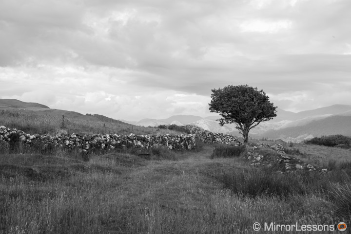
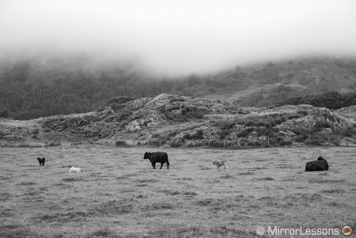
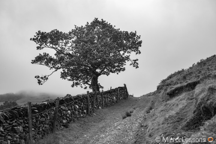
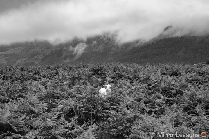
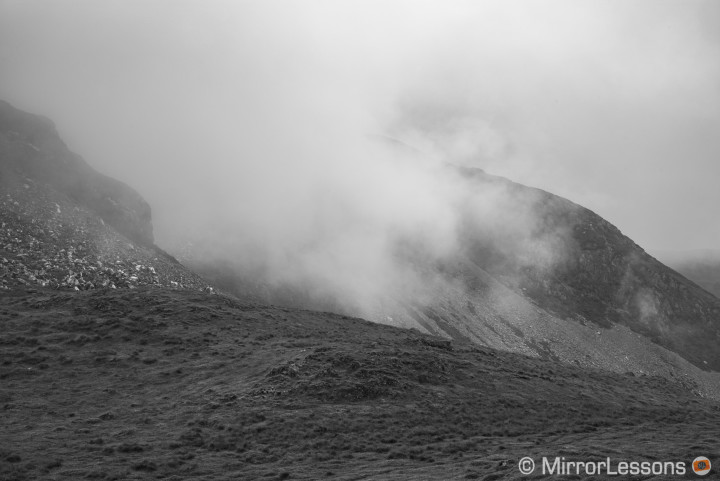
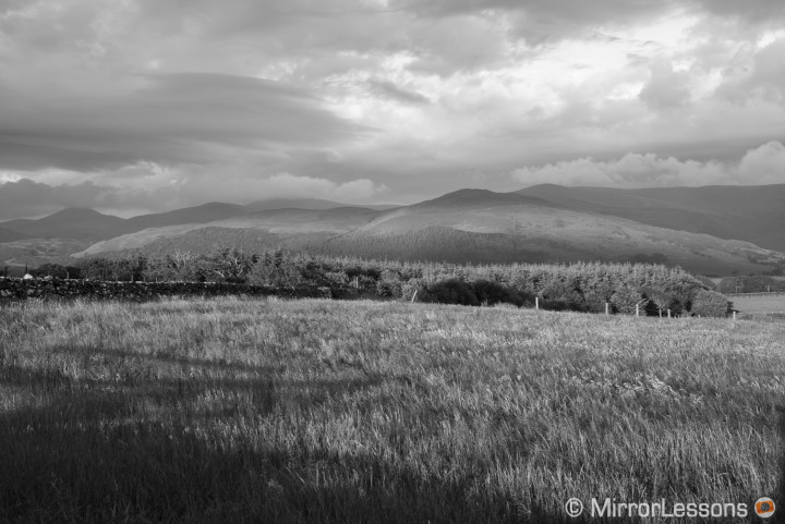
I sometimes forced myself to shoot with the camera when the light conditions weren’t ideal, such cloudy days or fog with no contrast. Most of the time, I was surprised by what the camera could render despite not being an ideal situation. It would take the most out of the small rays of light that were present and still render a good monochrom file. This only reconfirmed in my mind that mid tones are its best characteristic.
Another characteristic you can certainly appreciate about this camera are the low-light capabilities. Since it lacks colour filters, you don’t have to deal with colour noise. Instead, you have a finer, more organic grain that I actually find very pleasant. I could see myself doing a project specifically at high ISOs to experience with the film grain without using plugins or software to achieve the look. Image quality is fine up to 3200 ISO. From 6400 ISO, some banding starts to appear in the darkest areas of the image and shadow recovery becomes more limited with the Raw file. However, as far as mid-tones are concerned, the cameras excels even at 25000 ISO.
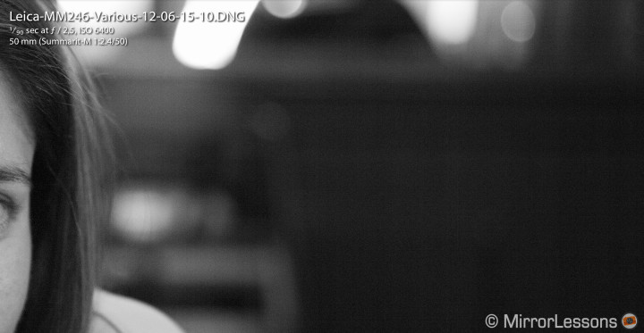
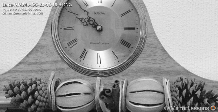
During my two-week testing period, I was able to appreciate black and white by approaching it from a different angle. I tried to post process my images as little as possible to remind myself that it isn’t just about high contrast. Is there a good and bad B&W then? I don’t think so, as it all comes down to the photographer’s personal style. But using this camera to then apply some quick B&W effects is probably not worth the effort or money.
Being the monochrom twin of the Leica M 240, the Typ 246 can also record Full HD video in black and white. I recorded some simple footage to share with you and that you can watch in the short video below. The monochrom rendering is not without its strengths and the contrast can be really pleasant. It is a shame that the camera doesn’t have more advanced features and a better video codec, as it would be even more unique.
The Leica Monochrom vs “the random camera”
At the end of my two weeks of testing, I couldn’t help but ask myself one last question:
If I were primarly a black and white photographer, could the Monochrom be the perfect tool? Or is the difference between it and other cameras, whose Raw files I can always convert into black and white, negligible?
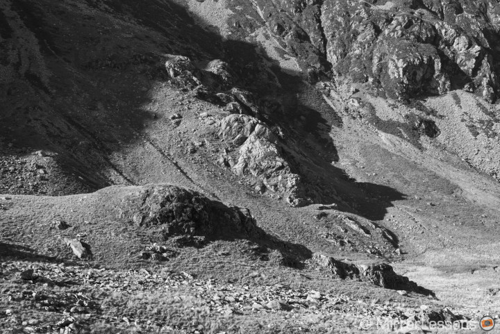
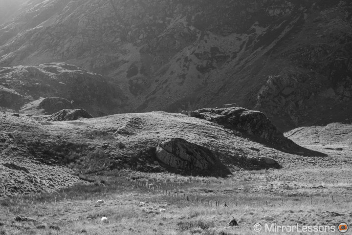
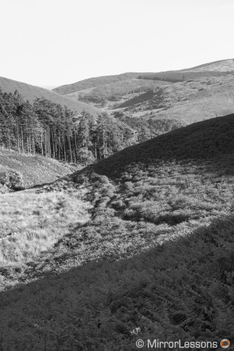
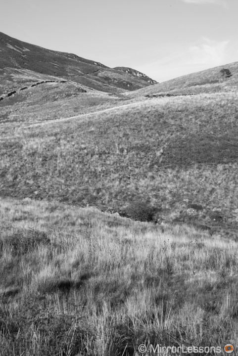
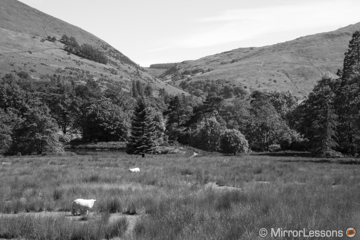
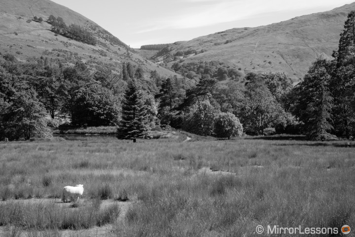
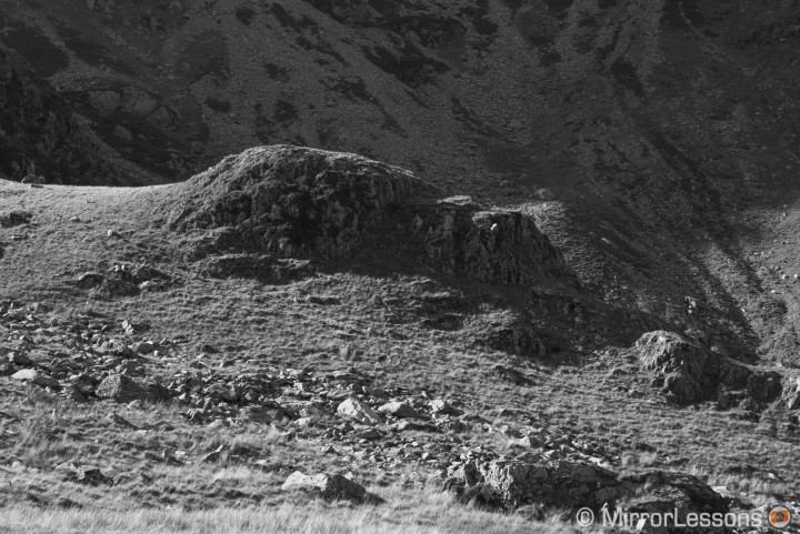
To answer that concretely, I brought the Monochrom and the Fuji X-T1 with me on a walk up Cader Idris mountain on a beautiful sunny afternoon to conduct a real-world comparison. Out of all mirrorless cameras, I consider the Fujifilm X series to be among the best for delivering good black and white images thanks to its film simulation profiles. If I had wanted to shoot B&W that day and I didn’t have the Monochrom with me, the Fuji would have been my first choice.
Note: I apologise for the compositions below being slightly different from one another.
Processing the Raw files in Lightroom and looking at the images on the computer, the differences are minimal. The Monochrom has more sensitiviy (1 Ev of difference more or less) and has a smoother rendering (less contrast) and more detail. The X-T1 tends to give more contrast with stronger shadows. To match both images as effectively as possible, I had to recover more shadows from the Fuji file. The overall look however is very similar.
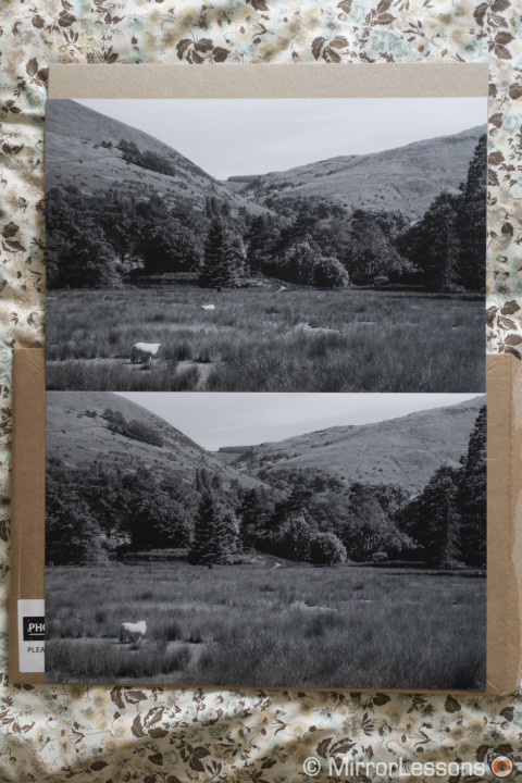
Finally I did a print comparison by ordering two 12×16 inch large prints.
Now you can pick on the paper, the printing technique, the lab, my post processing skills or even the example I decided to print, but the truth is that the difference between these two images is very small. I had to really concentrate to detect where the differences lay. The conclusion is the same as the one above: the Monochrom has finer detail rendering and slightly less contrast that reveals more shades of grey, especially in the darker areas. But when seen from the distance at which a print should be looked at, there are no relevant differences at all.
Before or After
From a simplistic point of view, the review of this camera could be synthesised like this: a very expensive black and white camera for connoisseurs. But skipping the recurring argument of price and value, I feel that the Leica Monochrom is the most difficult camera to purchase, yet the easiest to use – difficult because the temptation to use colour is always there for most people, but easy because your choices are limited. Perhaps it is Leica’s purest digital camera ever.
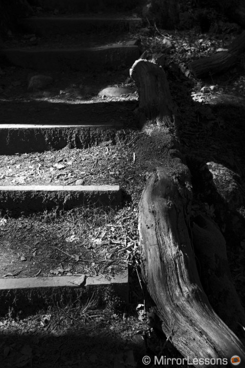
I am grateful to have had the chance to try the Monochrom. I now know that I wouldn’t buy it. Not because I don’t like it, not because it is too expensive but simply because I am not primarily a black and white photographer. I do enjoy monochrome at times – in fact, I’ve written a few posts about B&W photography and shared some galleries on this very website – but I can’t justify the investment for something that I wouldn’t use all that much. I admit I like the flexibility a colour camera can give me, even when I decide prior to the shoot that my results will be black and white.
The image below is what I consider to be my best monochrom image shot this year so far. Heather and I woke up early in the morning knowing that there would be a heavy fog in the city of Turin. After almost three hours of wandering around in the cold, the light suddenly became magical. I knew it would be a B&W day before stepping out my door. I processed it in Lightroom with Fujifilm’s monochrom profile. The black and white result I got is perfectly fine for me.
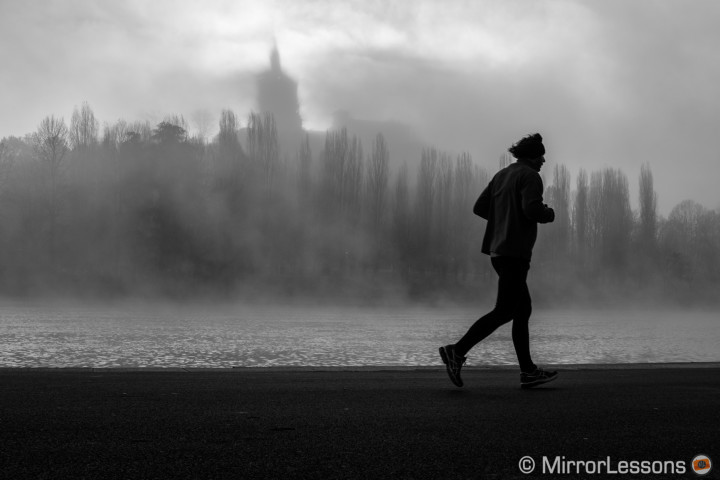
The Leica Monochrom is for a niche inside another niche. For those who always output their work in B&W, it can be the perfect camera.
It isn’t about the special sensor or the M lenses. The trick is that you don’t have any colour options. It is that simple, really. You either ignore it, regret it or embrace it.
 What I like about the Leica M Monochrom (Typ 246):
- As with any other M, it has a stunning build quality
- Beautiful black and white results especially in the mid-tones
- Excellent sharpness and detail rendering
- Beautiful organic noise at high ISOs
 What I don’t like about the Leica M Monochrom (Typ 246):
- Not worth the investment if you don’t do primarly black and white
- More limited dynamic range with the Raw files than traditional full-frame sensors
- Banding can appear past 3200 ISO
